Website Usability Testing: Manual vs AI
Website usability testing works best when manual research and AI testing cover different kinds of friction before users bounce.
Websonic Team
Websonic
Website usability testing is no longer a question of manual or automated. For most teams, the real question is which problems need human observation, and which ones should be caught automatically before they ever reach a customer?
That distinction matters because the gap between what teams intend to ship and what users actually experience is still huge. Baymard’s 2025 checkout benchmark found that 64% of leading desktop ecommerce sites and 63% of mobile sites still have a mediocre or worse checkout UX, while 62% of sites fail to make guest checkout the most prominent option despite 19% of shoppers reporting that they abandoned an order because they did not want to create an account. At the same time, qualitative usability research is still constrained by budget and logistics: User Interviews’ 2025 Research Budget Report found that headcount, tools, and participant recruitment consume 71% of research budgets, and Hubble notes that recruiting B2B participants often takes 2 to 4 weeks and $150 to $500 per hour in incentives.
So the tradeoff is not philosophical. It is operational. If you rely only on manual website usability testing, you get depth but not coverage. If you rely only on AI testing, you get coverage but not human interpretation.
The strongest teams now use both.
Quick verdict: Use AI website usability testing before launches, template updates, and major copy changes to catch repeatable friction fast. Use manual website usability testing when you need to understand trust, objections, or why users hesitate. For most teams, AI should be the always-on coverage layer and manual research should be the interpretation layer.
Website usability testing quick answer
If you are deciding between manual and AI website usability testing, start with the job to be done:
- Use AI website usability testing when you need fast coverage across homepage, pricing, signup, checkout, and mobile flows.
- Use manual website usability testing when you need to understand trust, confusion, objections, or why a user hesitated.
- Use both when the flow is high-stakes: let AI find repeatable friction first, then let humans explain the meaning behind it.
For most lean teams, the practical default is simple: run automated website testing before each release, then schedule manual sessions on the pages that still underperform.
If you only have 2 minutes: which layer should you use?
| If your question is… | Start here | Why |
|---|---|---|
| Are we shipping obvious friction across key pages? | AI website usability testing | It gives you fast coverage across homepage, signup, pricing, checkout, and mobile flows. |
| Why are high-intent users hesitating even when the flow technically works? | Manual website usability testing | Human sessions reveal trust gaps, confusing language, and emotional objections. |
| We are a lean team shipping every week — what is the default? | AI first, then manual on the highest-stakes flow | Continuous coverage catches repeatable UX drift, then humans investigate the bottlenecks that matter most. |
The operational case for hybrid website usability testing: recurring checkout friction is common, while manual research remains slow and expensive to scale.
What website usability testing is actually for
Website usability testing answers a simple question: can a real person complete an important task without confusion, friction, or second-guessing?
That sounds obvious, but many teams still confuse usability testing with technical QA.
Technical QA asks:
- Does the page load?
- Does the form submit?
- Does the button click?
- Does the layout break on mobile?
Website usability testing asks different questions:
- Can a first-time visitor understand what to do next?
- Is the primary action obvious?
- Does the page build trust at the right moment?
- Does checkout feel easy or exhausting?
- Does the mobile experience help or hinder completion?
A site can pass QA and still lose users every day.
That is why usability testing matters. It is the layer that catches the problems users feel, not just the problems engineers can reproduce.
Why manual website usability testing still matters
Manual usability testing remains the best way to understand motivation, hesitation, and interpretation.
When you watch a real person use your site, you see things automation cannot fully explain:
- the moment they stop trusting a page
- the second a headline feels vague
- the confusion caused by an internal term your team has stopped noticing
- the reason a pricing table feels riskier than you expected
- the emotional reaction to a form, checkout step, or empty state
This is why the classic Nielsen Norman Group guidance still holds up: for qualitative usability work, small tests with 5 users often surface most major issues, and repeated small rounds are more valuable than one giant study. Manual sessions are where teams learn why a problem exists and which fix is most likely to work.
Manual testing is especially strong when you need to answer questions like:
1. Does the value proposition make sense?
An AI system can flag weak hierarchy or a crowded hero section. It cannot fully tell you whether a buyer understood your positioning, believed your proof, or felt that your product was relevant to their problem.
2. Which objections are emotional, not structural?
Users hesitate for reasons that do not always show up in the interface itself. They may worry about vendor lock-in, distrust your claims, or feel uncertain about whether they are “the right kind” of customer for the product. Those are human signals.
3. Are users interpreting the experience the way you intended?
Sometimes the interface works exactly as designed, but the design itself sends the wrong message. A “Book a Demo” button can feel high-commitment. A freemium signup form can feel like a sales trap. A pricing tier can look like it is meant for someone else.
You learn those things by listening.
Why manual website usability testing breaks down
The problem is not that manual research is bad. The problem is that it does not scale cleanly.
Even teams that believe in research run into the same bottlenecks:
- participant recruitment takes time
- incentives cost money
- moderation requires skilled people
- analysis takes longer than most sprint cycles allow
- one study only covers a narrow slice of pages and flows
That is why so many teams end up doing usability testing in bursts: before a redesign, before a launch, or after a drop in conversion. But UX debt accumulates between those moments. New landing pages ship. Templates change. Flows get patched. Copy drifts. Mobile regressions slip in.
By the time the next manual study starts, the site may already contain a new generation of avoidable friction.
This is exactly where AI testing becomes useful.
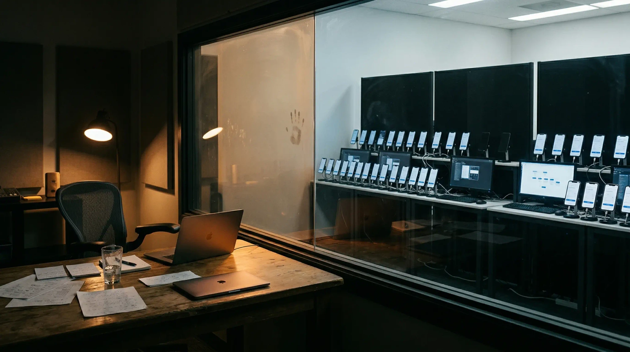
What AI website usability testing is good at
AI testing is strongest when the problem is repeatable, visible, and expensive to miss.
It does not replace good researchers. It gives teams a way to run broader checks more often.
A strong AI website usability testing workflow can catch patterns like:
- weak or hidden calls to action
- cluttered page hierarchy
- long or intimidating forms
- mobile layouts that bury the next step
- confusing checkout sequences
- missing trust signals near decision points
- pages that make users work too hard to understand the offer
- inconsistent UX across similar templates or flows
If you want concrete examples of those patterns in the wild, our breakdown of The $50K Button shows how CTA and hierarchy issues create outsized revenue losses, our guide to form UX testing digs into one of the highest-friction paths teams keep shipping, our post on website usability testing with heatmaps shows how click and scroll patterns make those issues visible before conversion data fully catches up, and our guide to agentic testing vs. AI-assisted testing explains where adaptive execution belongs once the real problem is test upkeep rather than basic page friction.
This matters because many usability failures are not unique mysteries. They are recurring patterns.
Baymard’s checkout research is useful precisely because it shows how often the same problems repeat across major websites. Forced account creation, weak guest checkout visibility, unclear delivery language, and complex form patterns keep showing up because teams keep shipping them. Those are exactly the kinds of issues an AI-driven workflow should help flag early.
What should AI catch first before you spend time on manual testing?
If your team only has time for one fast pass before a release, start with the friction types that are both common and expensive:
| Check this first | Why AI should own the first pass | Bring in humans when... |
|---|---|---|
| CTA clarity on homepage, pricing, and landing pages | Weak hierarchy and buried next steps are repeatable visual problems across templates | You need to understand whether buyers still mistrust the offer even after the CTA is obvious |
| Signup, lead forms, and checkout friction | Field count, guest-checkout visibility, validation loops, and step complexity are recurring patterns that appear before analytics fully catches up | You need to hear what made the form feel risky, invasive, or not worth finishing |
| Mobile path regressions | Sticky bars, hidden buttons, long forms, and narrow-view hierarchy failures are easy to miss internally but repeat across breakpoints | You need to know whether the mobile experience feels credible enough to complete on the go |
| Template drift after copy or design changes | Automation is strong at rechecking the same core paths after every release | You need to decide whether the page still tells the right story to the right buyer |
Fast rule: let AI catch visible, recurring friction first. Use manual website usability testing when the remaining problem is about trust, interpretation, or buying psychology.
Where AI testing wins
1. Coverage
Manual studies usually inspect a few flows. AI testing can inspect far more pages, variants, and task paths in much less time.
That makes it valuable for:
- pre-launch reviews
- recurring homepage and landing-page audits
- signup and checkout monitoring
- mobile and desktop regression checks
- template-level UX consistency reviews
2. Speed
A human study may take days or weeks to organize. Automated testing can run before each release, after major copy changes, or as part of a regular QA loop.
That changes the economics of website usability testing. Instead of waiting for enough pain to justify a full study, teams can catch more issues while they are still cheap to fix.
3. Consistency
Humans are excellent at noticing nuance, but they are not always consistent at checking every page the same way every week. AI systems are useful precisely because they are repeatable. They can apply the same lens across a large set of pages and highlight where the experience starts to drift.
4. Practical support for lean teams
If your research budget is already stretched across people, tools, and recruitment, automation gives you another way to maintain UX coverage without pretending you can moderate sessions for every release.
For smaller product teams, that is often the most realistic path.
Where AI testing stops
This is where teams get sloppy if they over-believe the tooling.
AI can identify likely friction. It cannot fully understand human stakes.
It can tell you a form looks long. It cannot tell you whether the user tolerated the length because the perceived reward was high.
It can flag a vague headline. It cannot fully know whether the audience read that vagueness as harmless, confusing, or dishonest.
It can detect that a path is cluttered. It cannot replace the insight you get from hearing a customer say, “I thought this product was only for enterprise teams, so I stopped.”
In other words:
- AI is good at finding likely UX risks.
- Humans are better at explaining meaning, trust, and priority.
That is the line.
The split is not manual versus AI. It is depth versus coverage, which is why strong teams use both.
Manual vs AI website usability testing: when to use each
If you need a practical rule, use this one.
Use manual website usability testing when you need to understand:
- why users hesitate
- how they interpret your messaging
- what trust signals they need
- whether a flow feels credible, risky, or confusing
- which issue matters most to fix first
Use AI website usability testing when you need to:
- audit many pages quickly
- catch repeatable UX problems before launch
- monitor core flows more often
- spot regressions across mobile and desktop
- give lean teams broader coverage between research rounds
The mistake is treating these as substitutes.
They are complements.
A better operating model for most teams
The best setup for most companies is not “replace usability research with AI.” It is a layered workflow.
Before release
Run AI website usability testing across:
- homepage and top landing pages
- pricing and signup flows
- checkout or lead-capture paths
- mobile and desktop variants
- any page where conversion matters
This catches obvious friction before it reaches the public.
After release
Use analytics and behavior data to see where users struggle:
- form dropoff
- bounce and exit patterns
- session recordings
- support tickets
- sales objections
This helps you decide where manual testing should go deeper. If you need a pattern library for what recurring friction actually looks like in production, our breakdown of silent conversion killers is a useful companion here.
Then run manual studies where the stakes are highest
Bring in real users to inspect:
- major conversion pages
- underperforming flows
- pages with high traffic but weak conversion
- parts of the site where trust and clarity matter most
That is how you combine automation’s speed with human judgment.
A practical default stack for lean teams
If your team ships often and does not have a full-time research bench, use this operating cadence as the default:
| Cadence | Layer | What to check | Why this layer goes here |
|---|---|---|---|
| Before every release | AI website usability testing | Homepage, pricing, signup, checkout, and mobile paths | Fast repeatable coverage catches obvious friction while fixes are still cheap |
| Weekly | AI website usability testing | Template drift, CTA clarity, mobile regressions, and form friction | Most UX debt is gradual drift, not one dramatic bug |
| Monthly or after major conversion drops | Manual website usability testing | Trust, objections, confusing positioning, and hesitation in high-stakes flows | This is where you need human interpretation, not just pattern detection |
| After AI flags a recurring issue | Manual spot-check or moderated session | Whether the detected friction is real, costly, and worth prioritizing now | Humans decide meaning and priority after automation finds the pattern |
For most teams, that cadence is the real answer to the manual-vs-AI debate: let automated website testing handle always-on coverage, then spend manual research time where buyer psychology and trust actually matter.
Website usability testing: which method fits which job?
| Situation | Best fit | Why |
|---|---|---|
| Pre-launch review of homepage, pricing, signup, and checkout | AI website usability testing | Fast coverage across the pages most likely to leak conversion |
| Weekly regression checks after copy or design changes | AI website usability testing | Repeatable checks catch hierarchy, CTA, and mobile drift early |
| Investigating why high-intent users still hesitate | Manual website usability testing | Human observation reveals trust gaps, objections, and interpretation problems |
| Auditing a large site with many templates or markets | AI website usability testing + spot-checking | Automation finds repeatable patterns, then humans validate the highest-risk areas |
| Reworking a weak value proposition or confusing pricing page | Manual website usability testing | You need live reactions, not just pattern detection |
| Lean team shipping fast with limited research budget | AI first, then manual on the biggest bottlenecks | Coverage stays on continuously while human time goes where stakes are highest |
The point of this matrix is not to defend one camp. It is to make website usability testing more operational. If the problem is broad, repetitive, and easy to miss, start with AI. If the problem is about trust, meaning, or buyer psychology, bring in humans.
The real goal of website usability testing
The point of website usability testing is not to produce a longer findings document. It is to remove the small moments that cause users to pause, doubt, or leave.
Manual research helps you understand those moments. AI testing helps you find more of them before they pile up.
For teams shipping often, that combination is becoming the sensible default.
Not because AI replaces user research. Not because five-person studies stopped mattering. But because modern websites change too often to rely on periodic human testing alone.
If you want deeper coverage of recurring UX issues before launch, read our guide to automated website testing. If you want a narrower look at AI-first review tooling, read AI website analyzer: what it finds that your team misses. If you are evaluating qualitative tooling, this guide on choosing a website feedback tool breaks down what surveys, widgets, and behavior-linked feedback can and cannot tell you — especially if your team keeps seeing drop-off data but still cannot tell what users actually found confusing. If you are comparing categories more broadly, read our guide to choosing a UX testing tool, then use our best UX testing tools in 2026 roundup to compare where manual research, session replay, and AI audits fit in a real stack. If you are preparing a release, pair this with our pre-launch UX checklist. And if your team is trying to do more with less research capacity, read Your Company Just Cut Its UX Team. Now What?. For the bigger strategic picture behind that workflow split, read UX Research in 2026: Why AI Is Making Human Judgment More Valuable, Not Less.
FAQ: website usability testing manual vs AI
Is AI website usability testing enough on its own?
Usually no. AI website usability testing is excellent for spotting repeatable friction like weak calls to action, cluttered layouts, confusing forms, and mobile regressions. But it cannot fully explain trust, motivation, or why a buyer interpreted a page the wrong way.
When should I choose manual website usability testing?
Choose manual website usability testing when you need to understand hesitation, objections, or credibility gaps. If the real question is "why are users not trusting this page?" or "why does pricing feel risky?" you need live human observation.
When should I choose automated website testing instead?
Choose automated website testing when you need broad, repeatable coverage across many pages or releases. It is the better default for pre-launch reviews, weekly UX regression checks, and lean teams that cannot run moderated studies every sprint.
What is the best workflow for lean teams?
For most lean teams, the best workflow is hybrid: run AI website usability testing continuously on core flows, then use manual testing on the highest-stakes pages that still show dropoff, hesitation, or weak conversion.
Sources
- Baymard Institute, Checkout UX Best Practices 2025
- Nielsen Norman Group, Why You Only Need to Test with 5 Users
- User Interviews, The 2025 Research Budget Report
- Hubble, Participant Recruitment in Usability Testing
Websonic helps teams run website usability testing faster by scanning live or staging pages for UX friction, visual clarity problems, and conversion blockers before users bounce.
Related Articles
UX Testing Tool: How to Choose the Right One in 2026
A UX testing tool should help you catch usability issues before launch. Here is how to compare manual, behavior, and AI-first options in 2026.
I Hate QA Testing (And So Do You)
Automated website testing replaces repetitive QA drudgery with screenshot-backed evidence across core flows, browsers, and viewports.
Maze Alternative: When the Question Is Friction, Not Recruiting
Maze is useful for prototype testing. Automated live-site audits are different: they find where shipped pages catch users, with screenshots and fixes.
Ready to test your UX?
Websonic runs automated UX audits and finds usability issues before your users do.
Try Websonic free